ClearRate
A platform that helps users search, scan, and compare products to find safer, more sustainable choices for themselves and for the planet.
Mobile App
Role
UX Research, UI/UX Design
Tools used




Project Overview
Why I created this app
When shopping for everyday products, I noticed how hard it is to understand what we are really buying. Ingredient lists are long and confusing, and information about environmental impact is often hidden or unclear. This makes it difficult for people to know if a product is safe for their skin or better for t he planet. I wanted to solve this problem by designing an app t hat makes product information easy to understand, quick to access, and simple to compare, so people can feel confident making healthier and more responsible choices.
About ClearRate
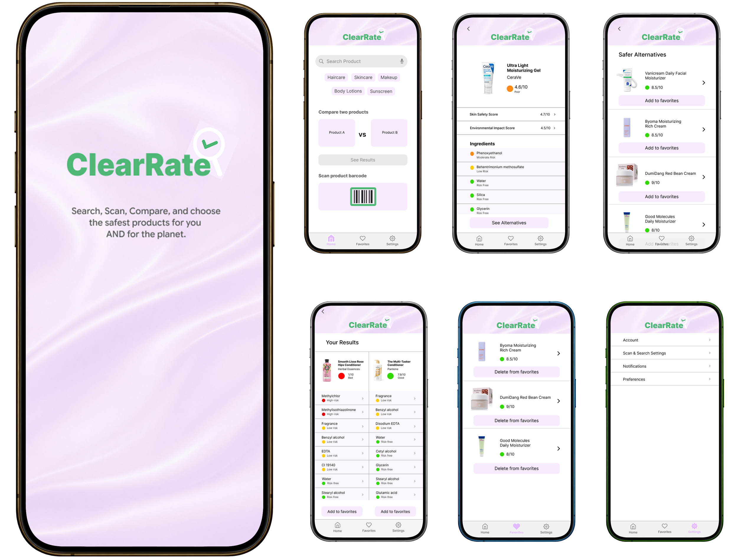
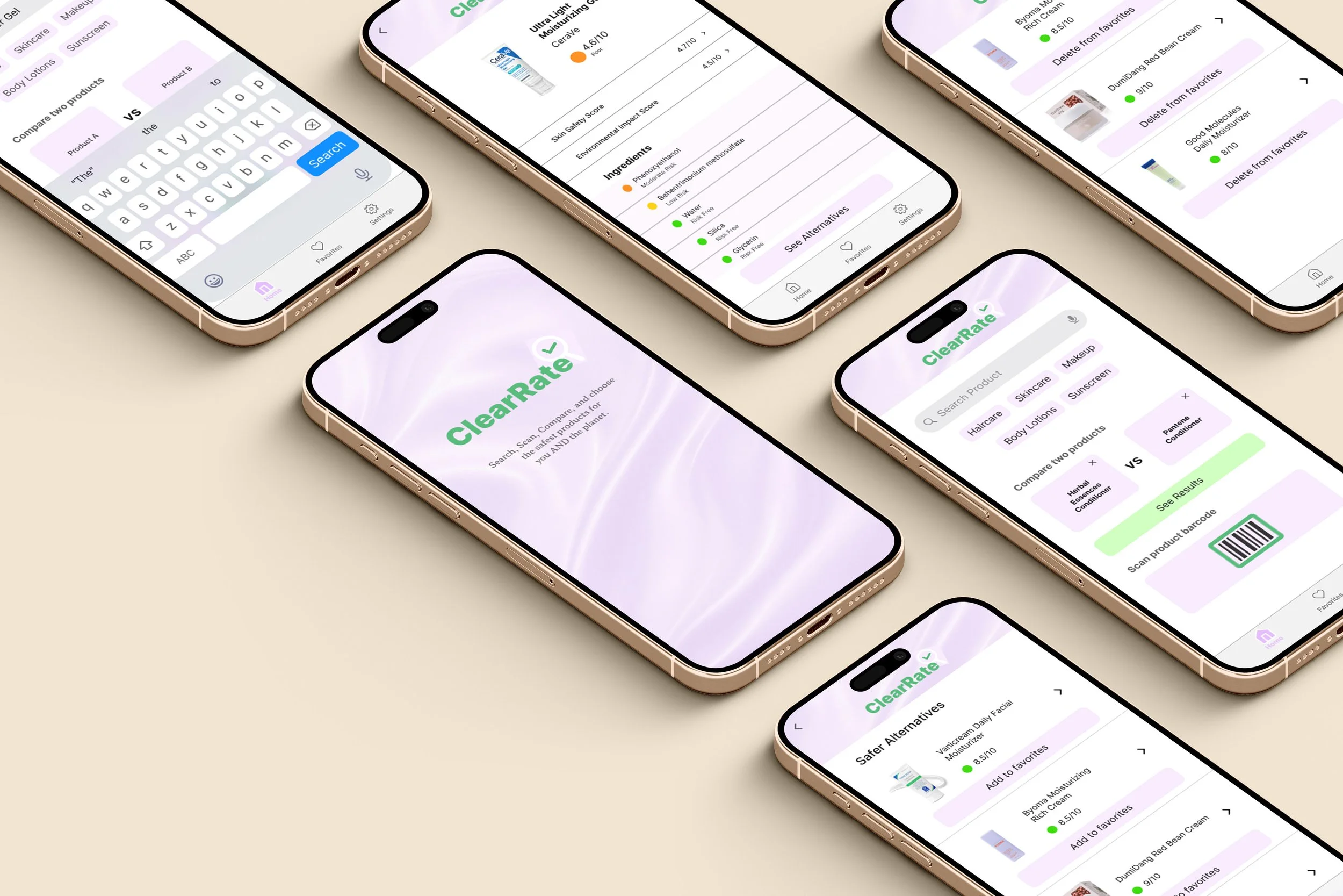
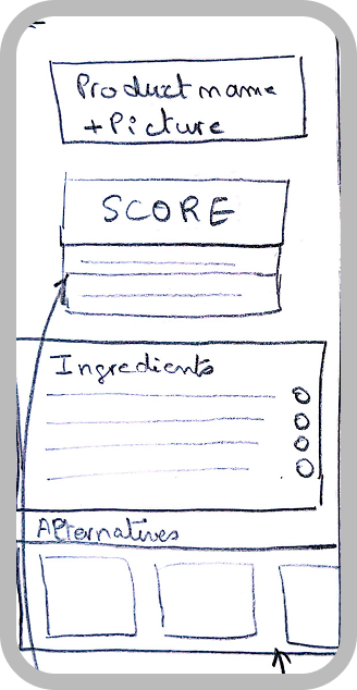
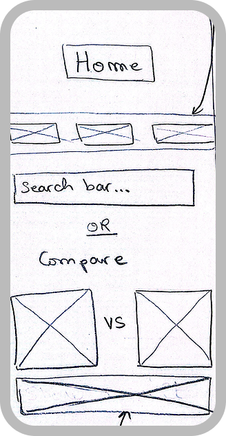
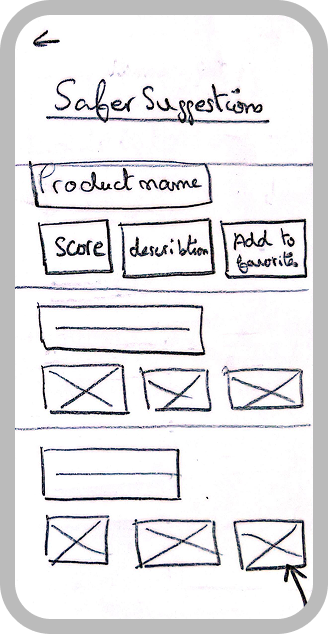
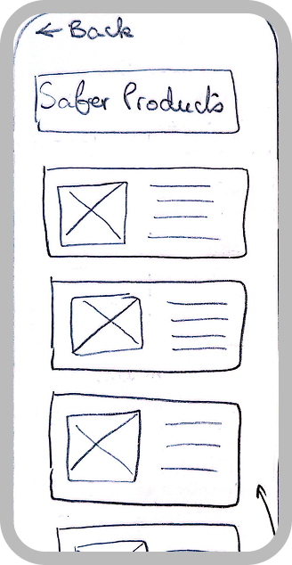
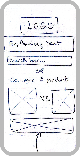
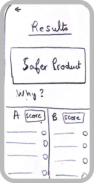
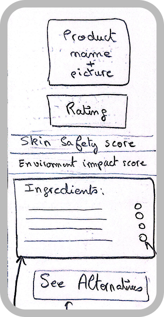
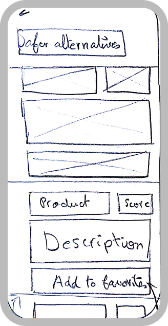
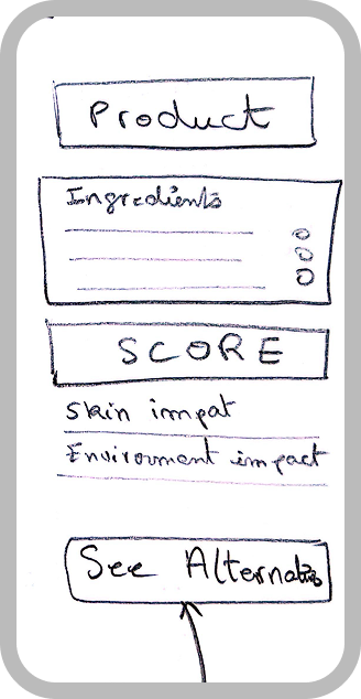
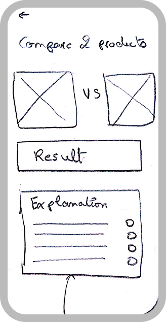
ClearRate is a mobile app designed to help users make more informed choices when shopping for skincare and beauty products. The app allows users to search for products by name or scan a barcode, view a breakdown of every ingredient flagged by safety level, compare two products side by side, and explore safer alternatives, all in one place.
User Persona
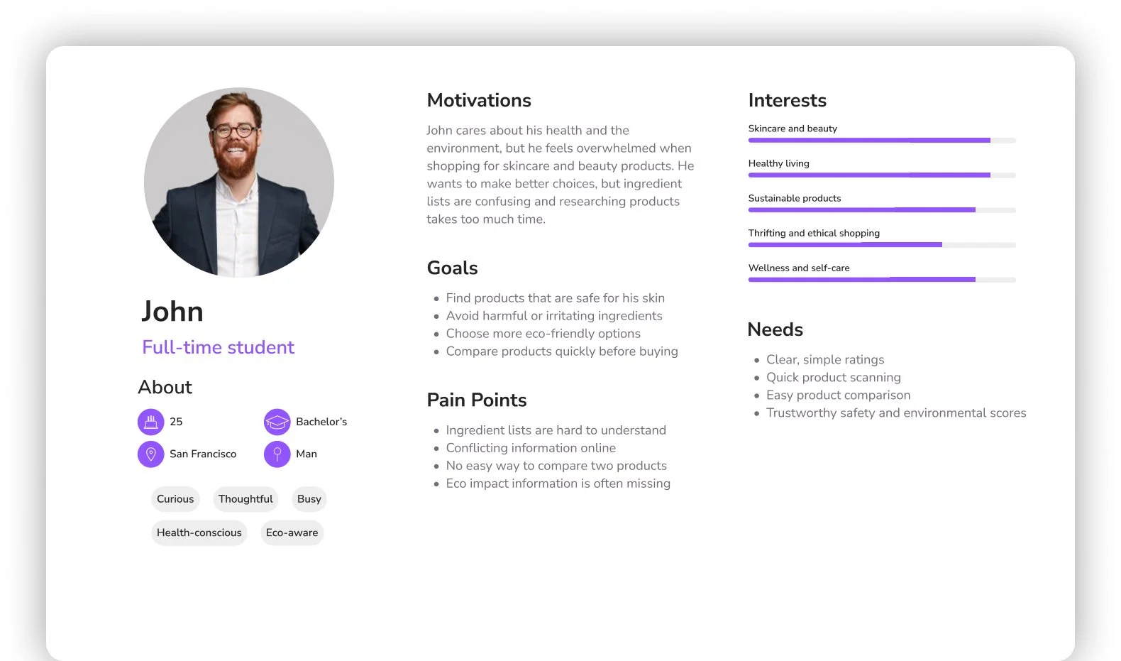
This persona was created during the research phase to synthesize key patterns observed in user behaviors, motivations, and frustrations around skincare and product transparency.
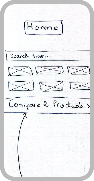
Early sketches
Mid Fidelity Wireframes

Usability Testing
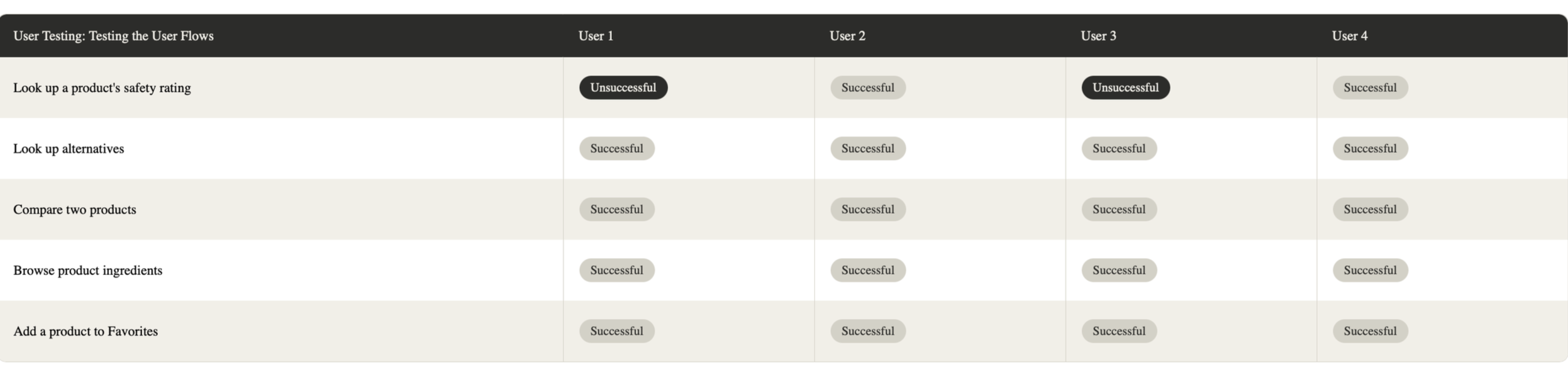
At this stage, I tested the mid fidelity prototype with 4 different users to evaluate how intuitively they could navigate the app and complete its core tasks. Each participant was given a set of tasks: exploring the app, looking up a product's safety rating, comparing two products, browsing product ingredients, adding a product to "Favorites," and removing a product from "Favorites." This round of testing was meant to surface navigation issues, unclear UI elements, and friction points before moving into high fidelity design.

Areas of success
All users completed the alternatives, comparison, ingredient browsing, and favorites tasks successfully
Bottom navigation (Home, Favorites, Settings) was intuitive across all testers
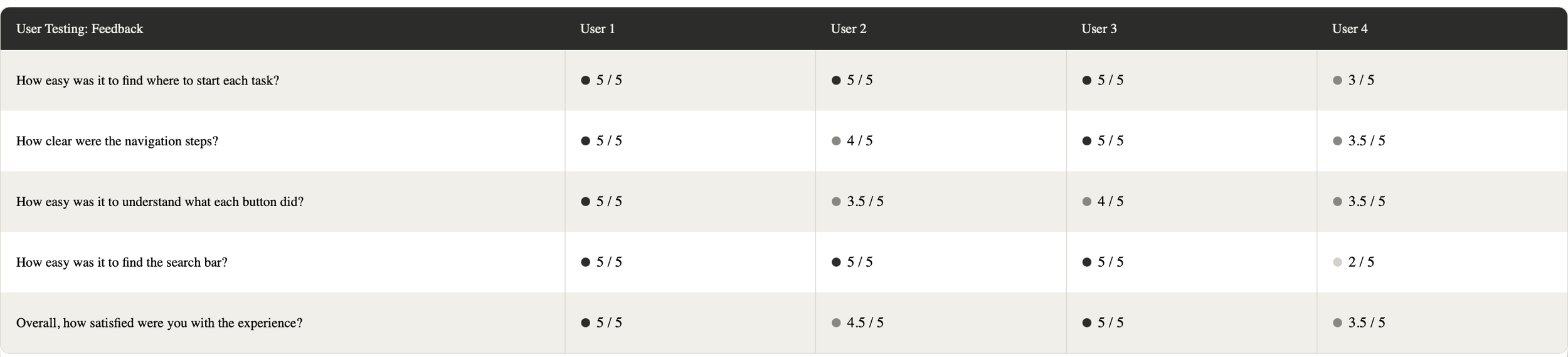
Navigation steps rated highly clear by most users
Overall satisfaction remained high even among users who faced early difficulties
Areas of improvement
The search bar's position caused 2 users to fail the safety rating task. Moving the search bar to the very top of the home screen above the category filters would make it immediately visible on landing
High Fidelity Wireframes
After analyzing the usability testing results, I addressed the identified issues, fixing navigation bugs, refining button interactions, and improving overall flow consistency. I then built a full UI style guide covering typography, color, spacing, alignment, and grid structure before moving into the final high fidelity wireframes.