Voices&Actions
Mobile App
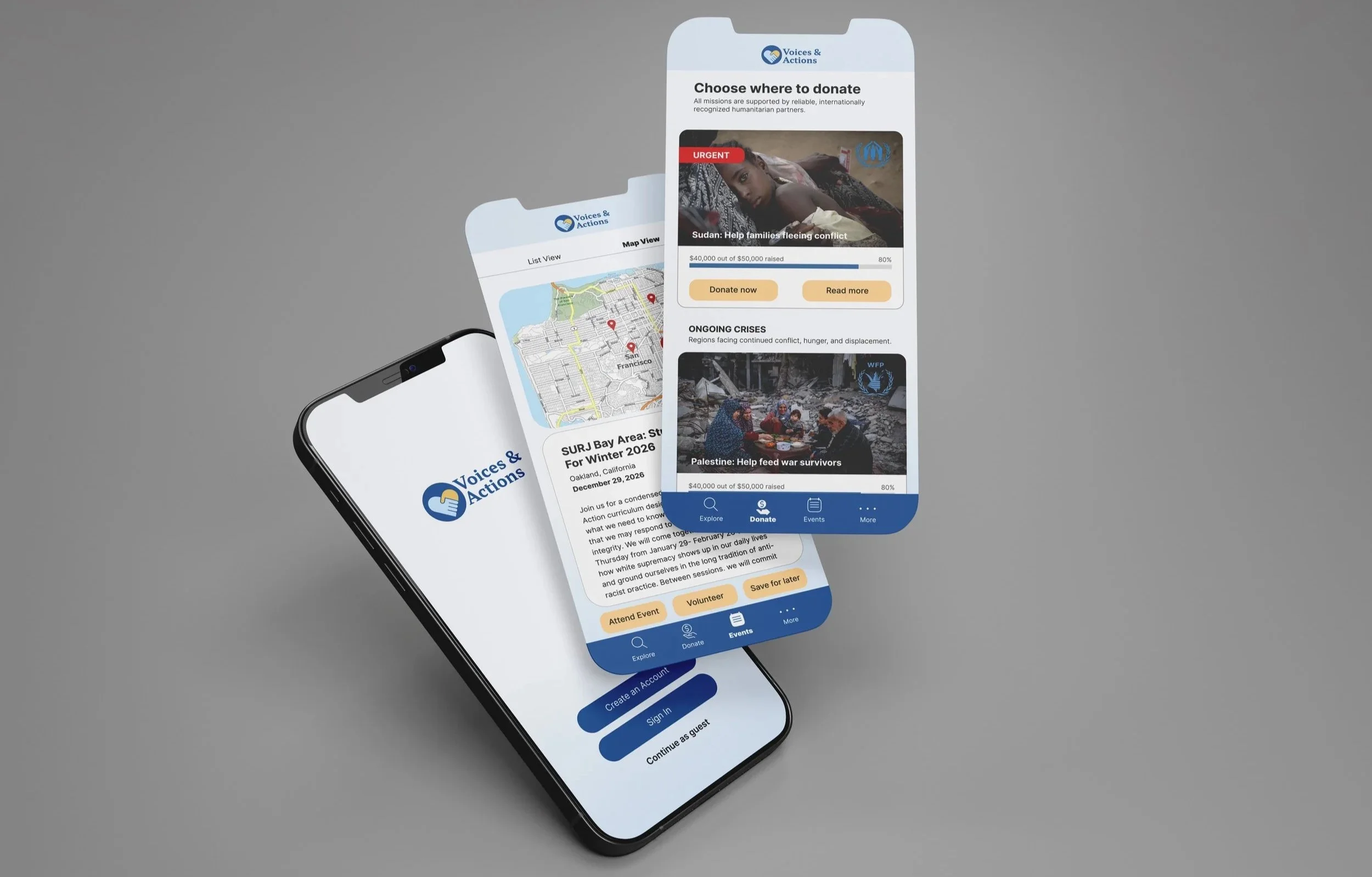
A platform that gives people the opportunity to help victims of war and take action through verified news, trusted organizations, donations and global solidarity opportunities.
Role
UX Research, UI/UX Design
Tools used

Project Overview
Why I created this app
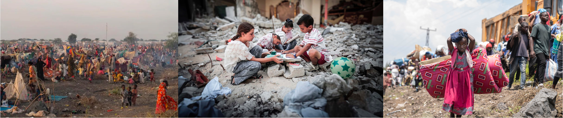
Right now, people around the world are living through war, displacement, and oppression. Families are losing their homes, their safety, and their loved ones. These crises don’t just affect the regions where they happen, they impact all of us, because they remind us of the importance of justice, peace, and human connection. It’s easy to feel distant from these struggles, but our involvement matters. Even small actions of solidarity, support, and care can make a real difference for people whose lives are being torn apart. The problem here is that many people want to help but don’t know where to start or which sources to trust.
Design Brief
This app gathers everything in one safe, reliable place: verified news, trusted organizations, and NGOs all in one spot. Users can learn about current issues, donate, find volunteering opportunities, and join events. It connects two groups: organizations who need support, and people who want to help but don't know where to start. The goal is simple — make global solidarity easier, more accessible, and more personal for everyone, whether someone has five minutes or wants to stay involved long-term.
Market Research
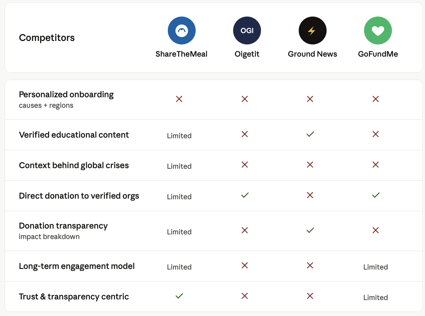
This analysis revealed a consistent pattern: existing tools optimize for either information (Ground News) or transaction (ShareTheMeal, GoFundMe), rarely both. None offered personalized onboarding by cause or region, and most treated engagement as a one-time action rather than an ongoing relationship.
These gaps directly informed three core product decisions: a guided onboarding flow, verified context paired with every campaign, and features designed for long-term, repeat engagement rather than
a single donation.
Notable comments
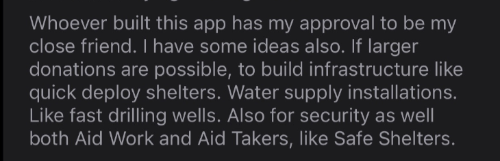
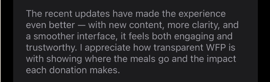
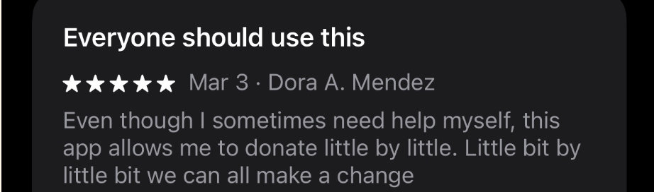
Reading reviews and comments from people who already use donation apps gave me direct insight into what builds trust around the most sensitive flow in this app: making a donation. Asking for money is different from asking for time or attention. Everyone's financial situation varies, and the interface needs to respect that. A few patterns stood out:
Simple interfaces convert better
Seeing impact builds trust
Small donations need context to feel meaningful
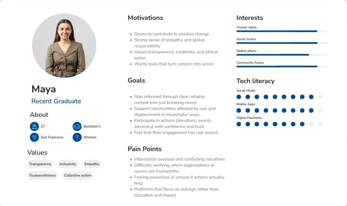
User Persona
The next step of my research focused on understanding who this app is actually for, their motivations, hesitations, and what would make them trust a platform enough to give. I built one user persona to ground my design decisions in real human needs.
User Flow Diagram
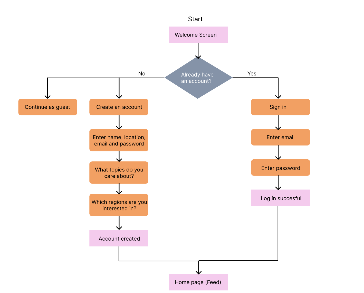
To outline the necessary functionality, I created simple user flow diagrams of the main tasks the user can do. Some of them is shown below
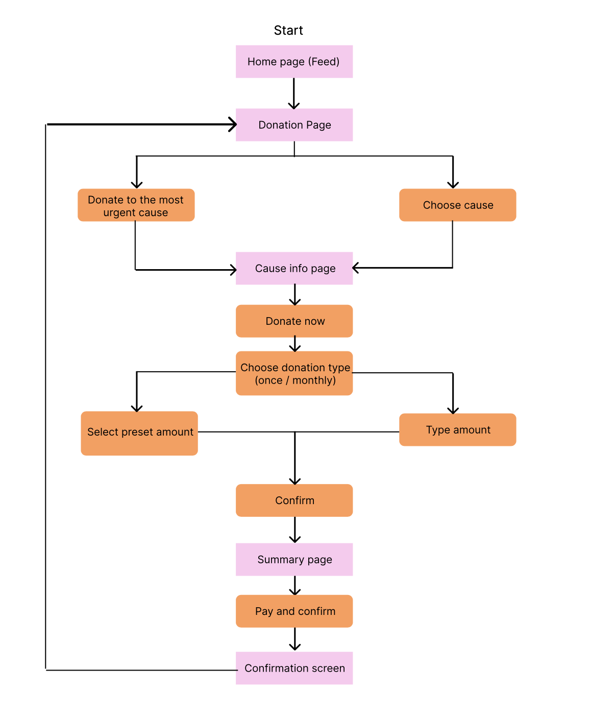
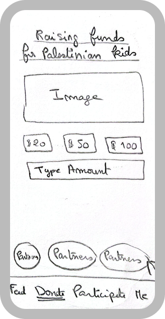
User flow 1: Making a donation
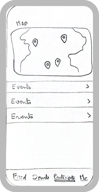
User flow 2: Signing up for an event
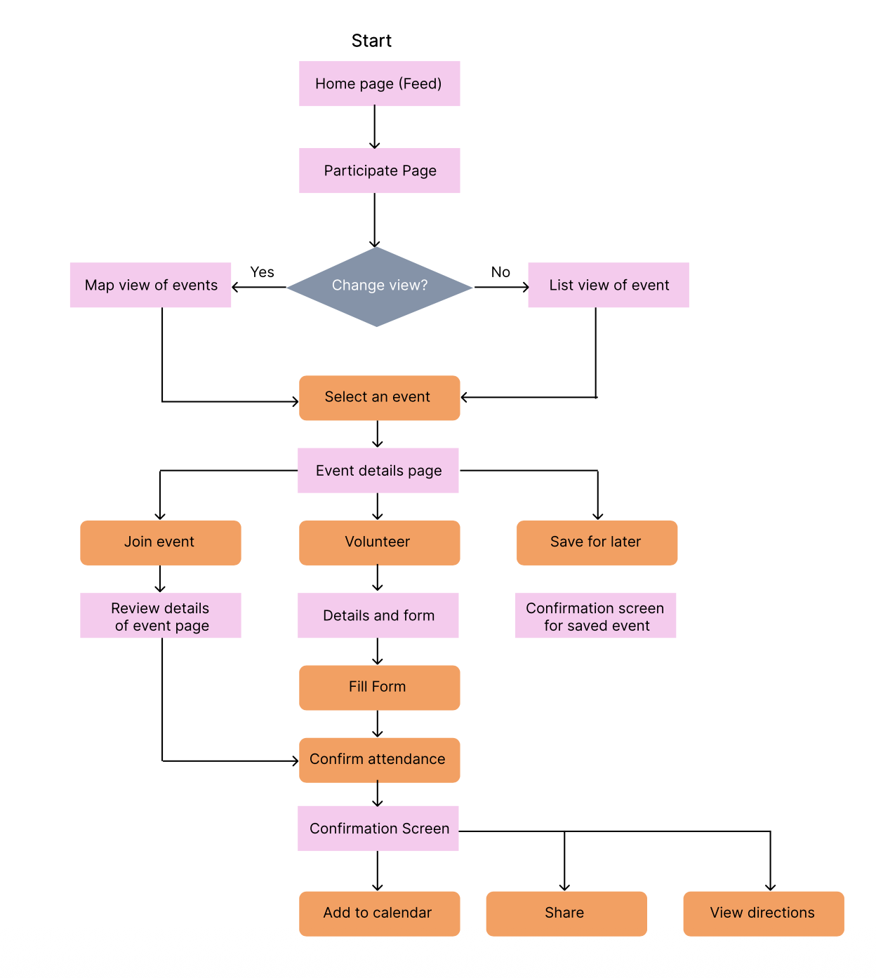
User flow 3: Creating an account
Early Sketches
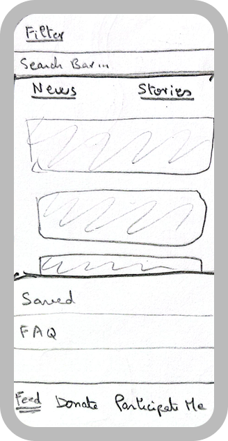
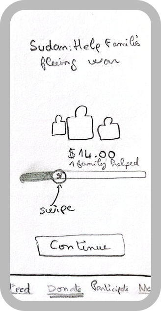
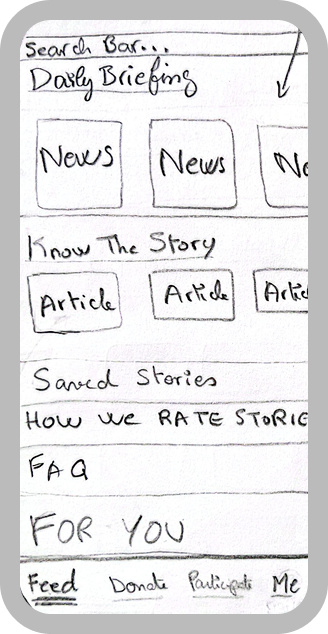
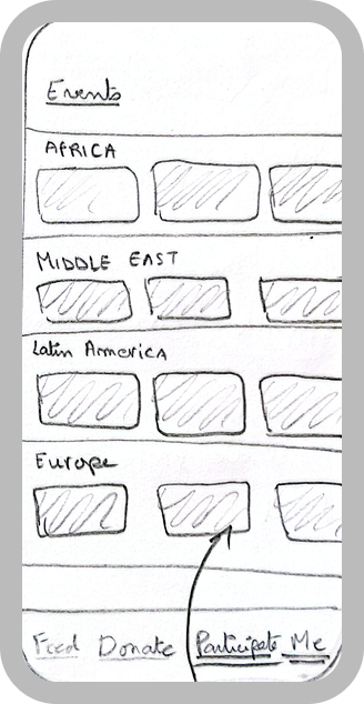
Based on the information gathered during the research stage of the project, I sketched out low fidelity wireframes for all the necessary screens to better represent the user flow.
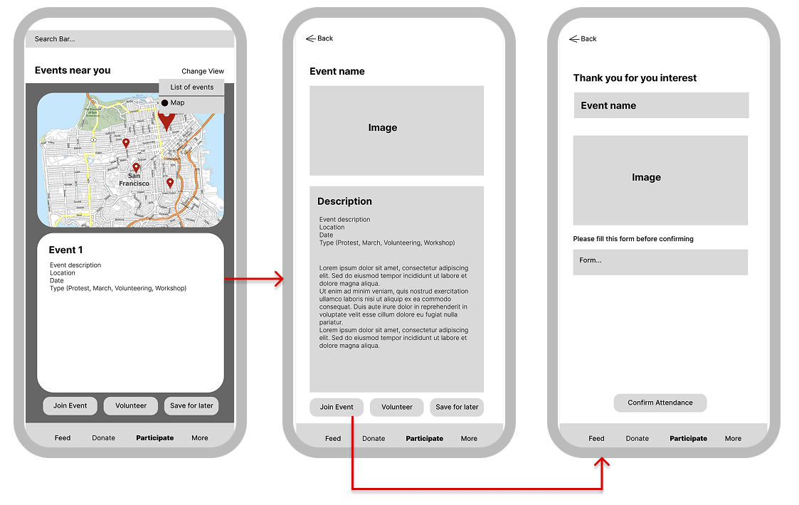
Mid Fidelity Wireframes
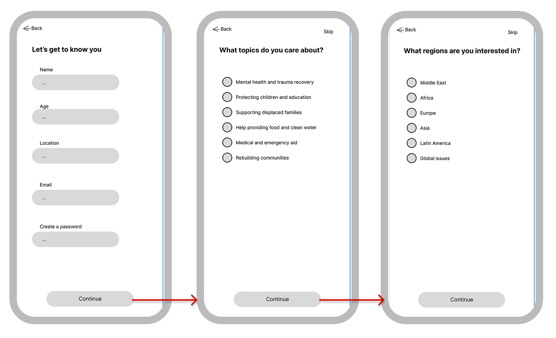
User flow 1: Creating an account
User flow 3: Signing up for an event
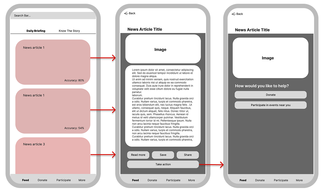
User flow 2: Navigating the feed
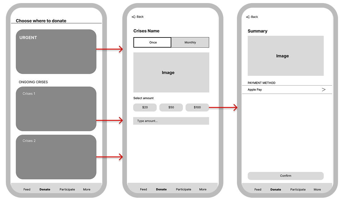
User flow 4: Making a donation
Usability Testing
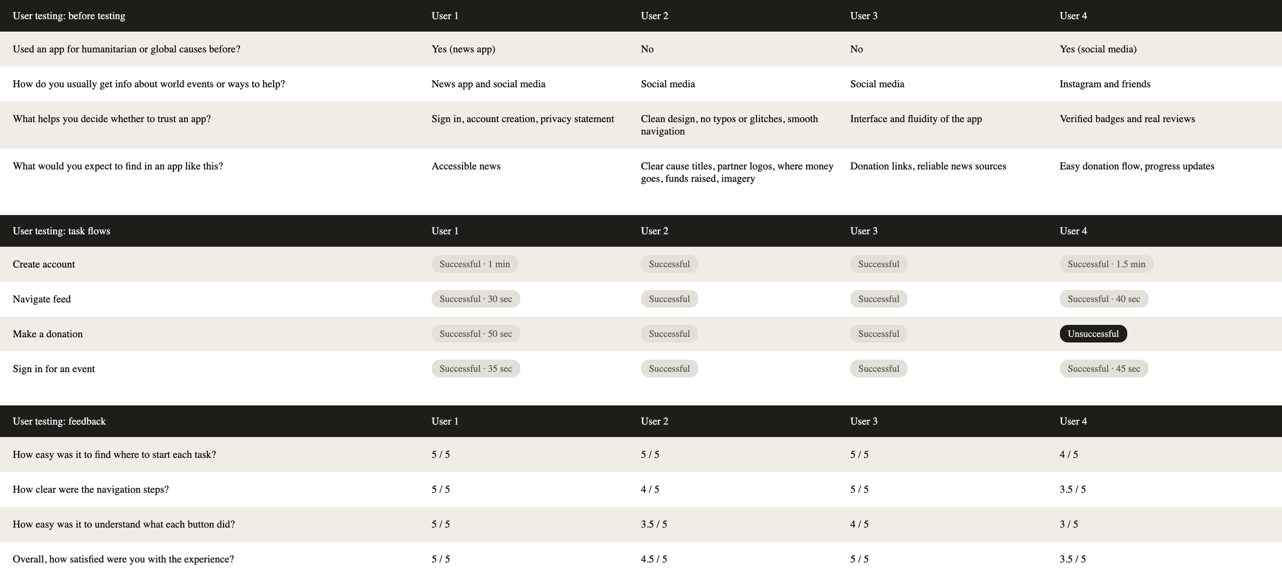
At this stage, I was testing the mid-fidelity prototype to check how well users could navigate the app's four main user flows and I ran these tests with three real users. The goal was to catch any confusion in the flow before moving into a higher-fidelity design.
Style Guide
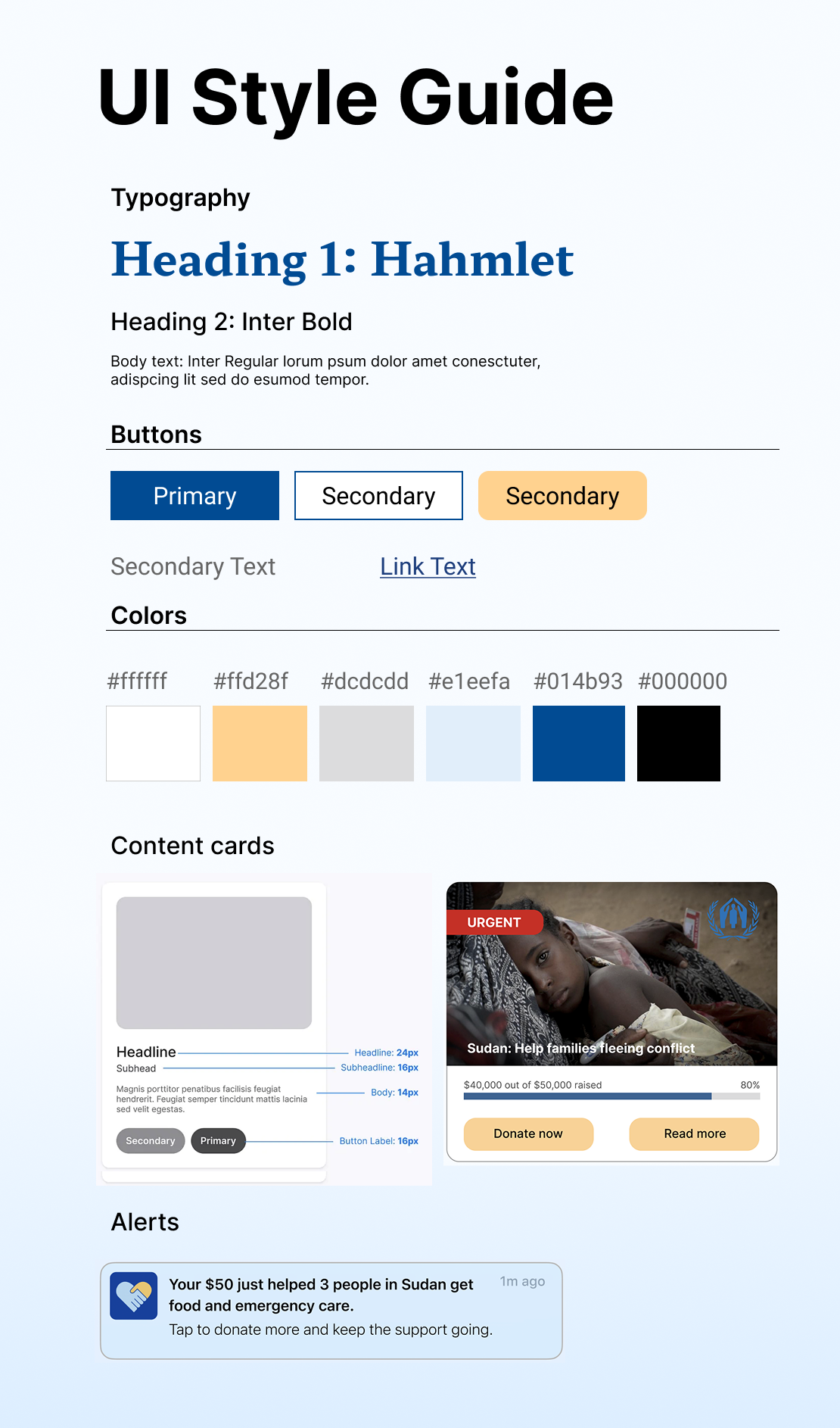
A visual identity was developed to define color system, typography, emotional tone and overall visual consistency.
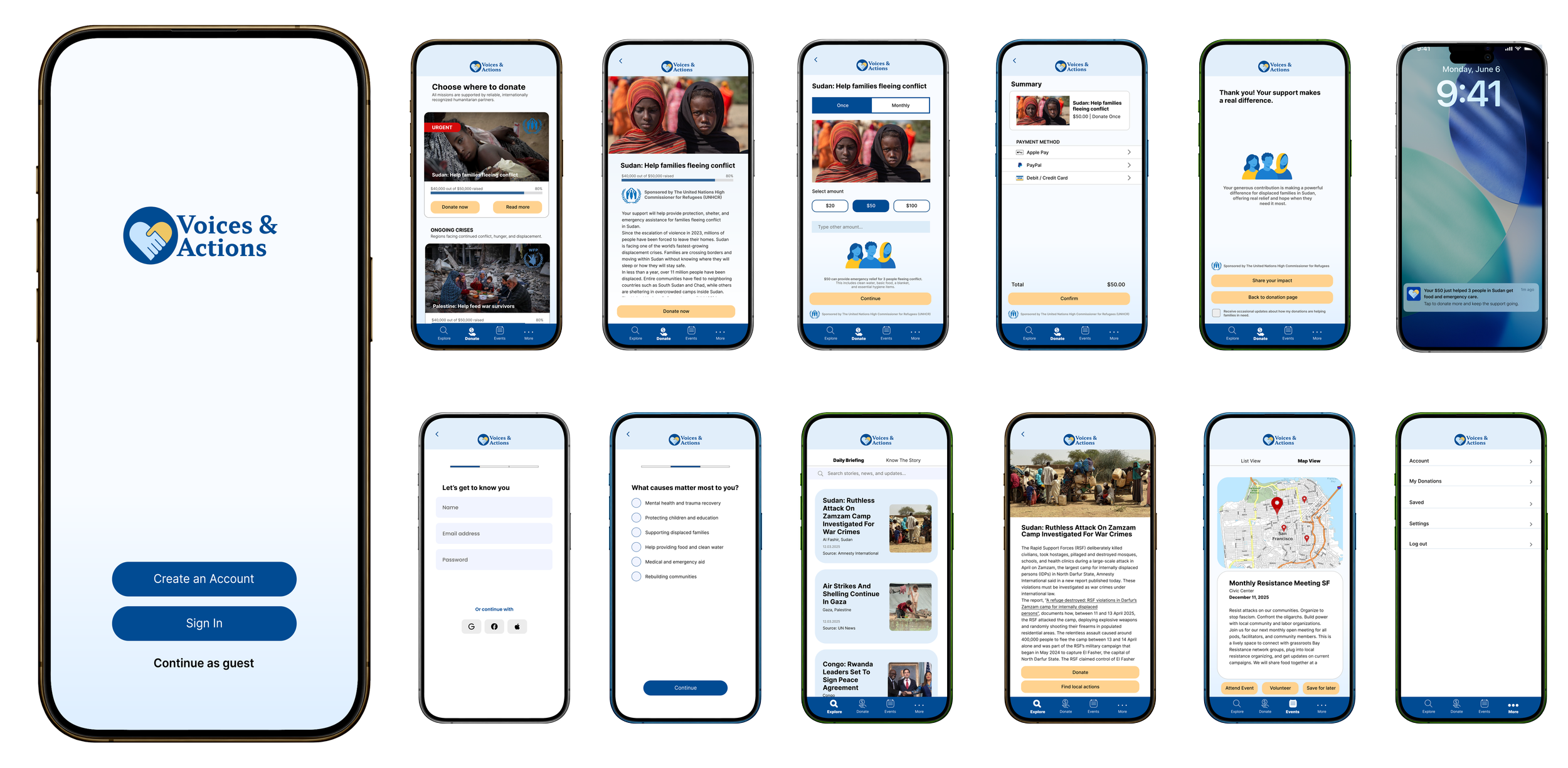
High Fidelity Wireframes
Explore the prototype!