Cafe Rosso
Rebrand
Role
Graphic Designer
Tools used



Overview and Objective
Cafe Rosso is a coffee and sandwich shop located on San Francisco State University campus, defined by an open, communal atmosphere that blends garden house warmth with industrial character. Our vision for their rebrand was to build upon this existing spirit and translate it into a cohesive visual identity that connects customers to the feeling of the space itself. The goal was to instill a sense of trust and tranquility, and to give students and faculty a welcoming place to rest, recharge, and socialize in the moments between
study and work.
Existing Visual Identity
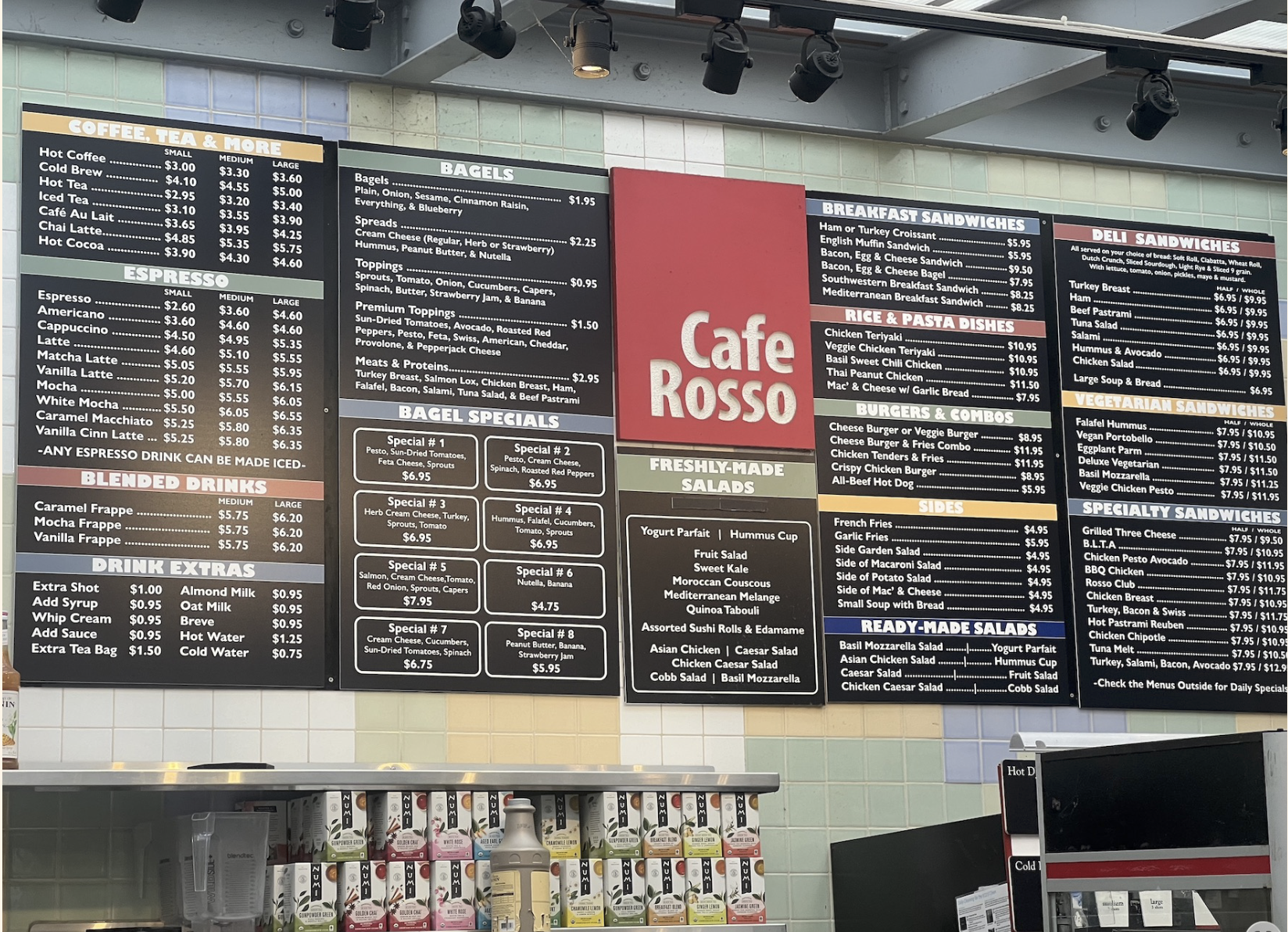
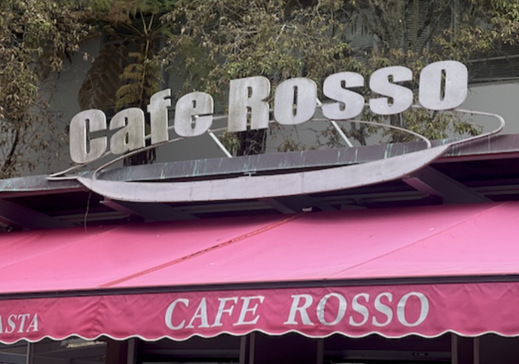
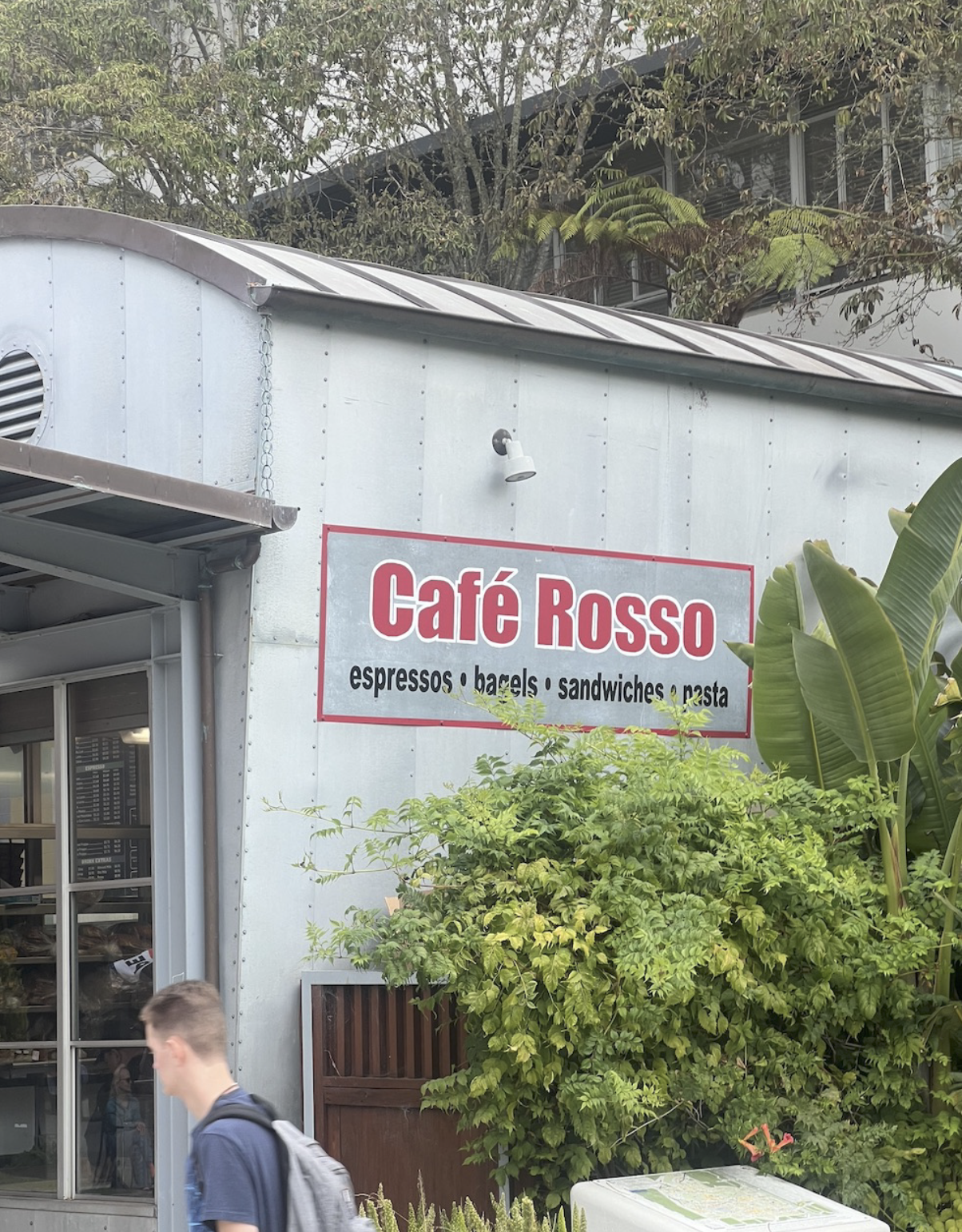
Cafe Rosso's existing identity, however, lacks consistent visual branding. Most notably, three different logo signatures appear across the front and side of the establishment, creating an fragmented and unclear brand presence. Without a unified visual language, it becomes difficult for customers to form a strong or lasting impression of who Cafe Rosso is.
Proposed Solution
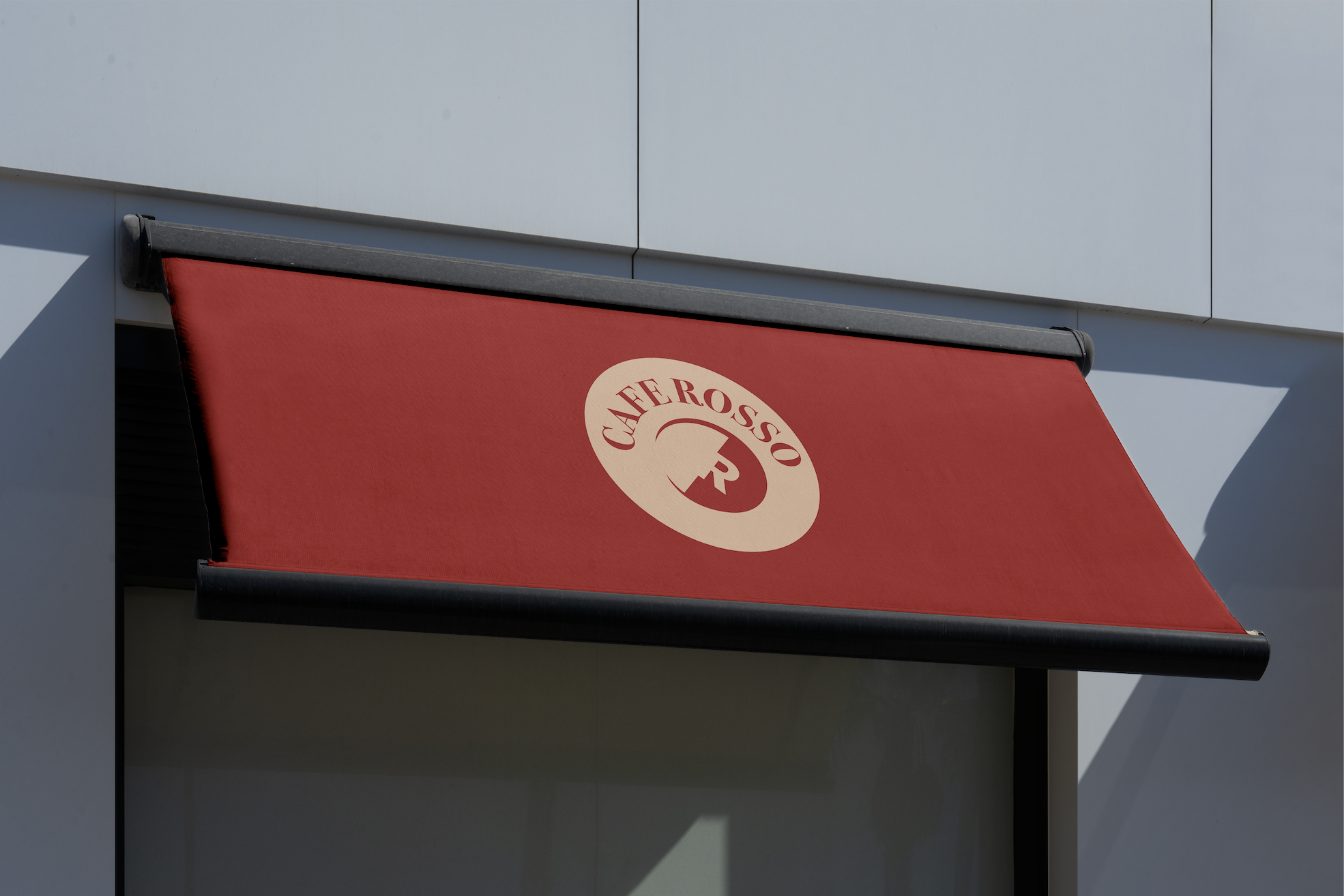
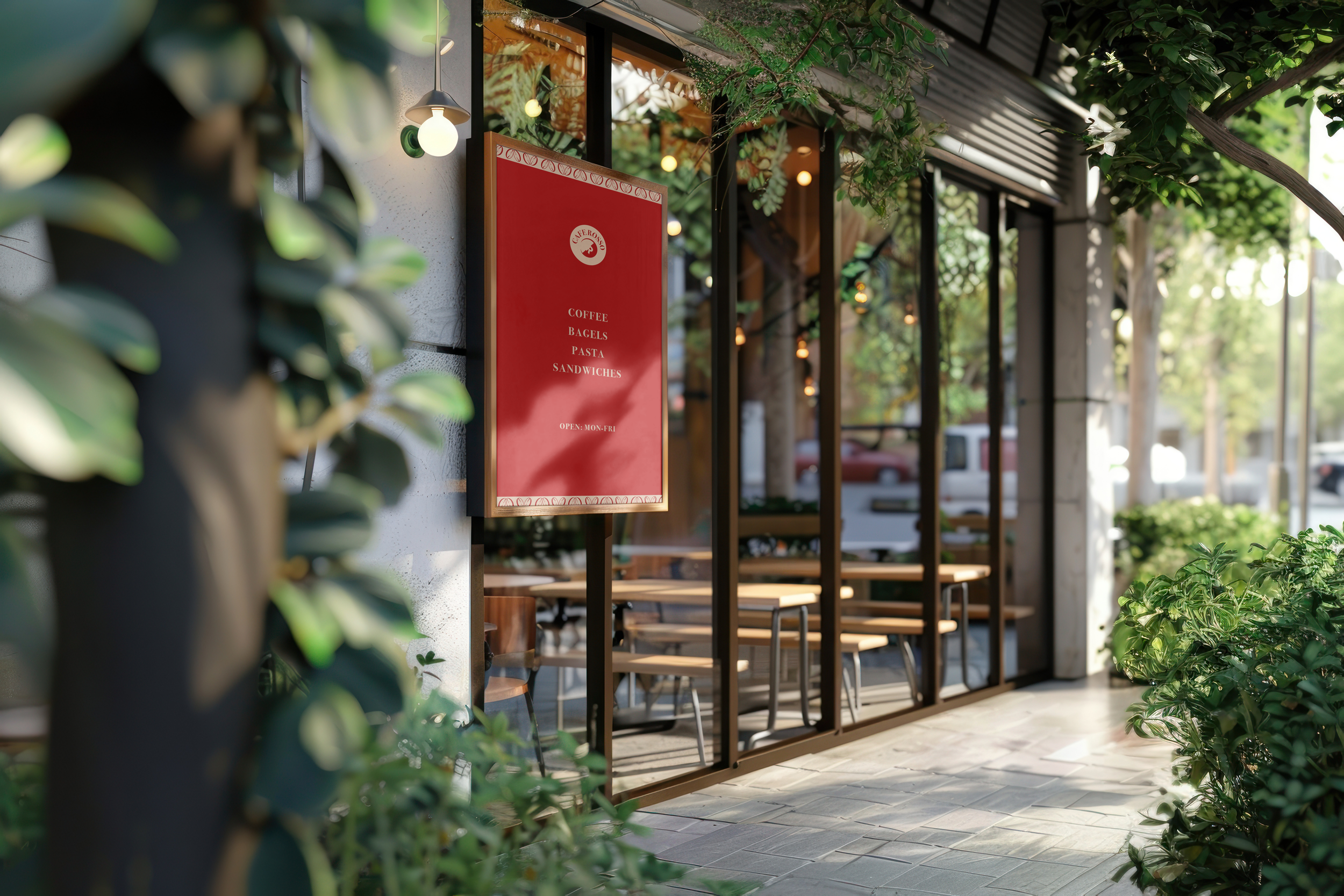
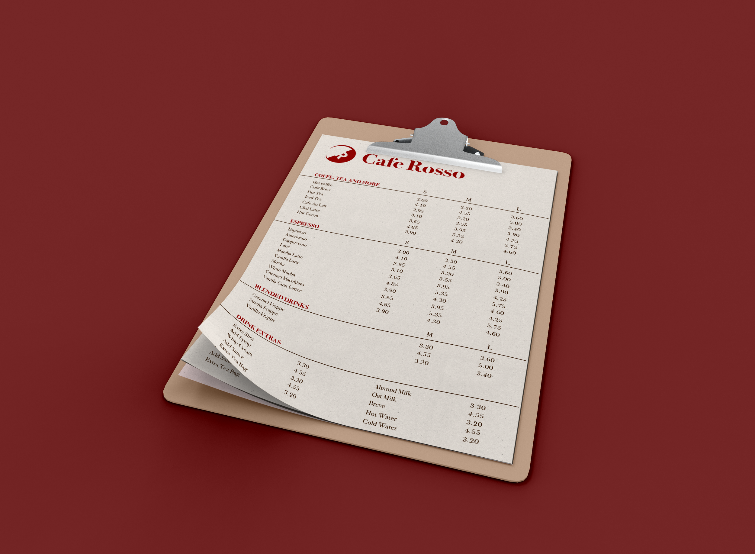
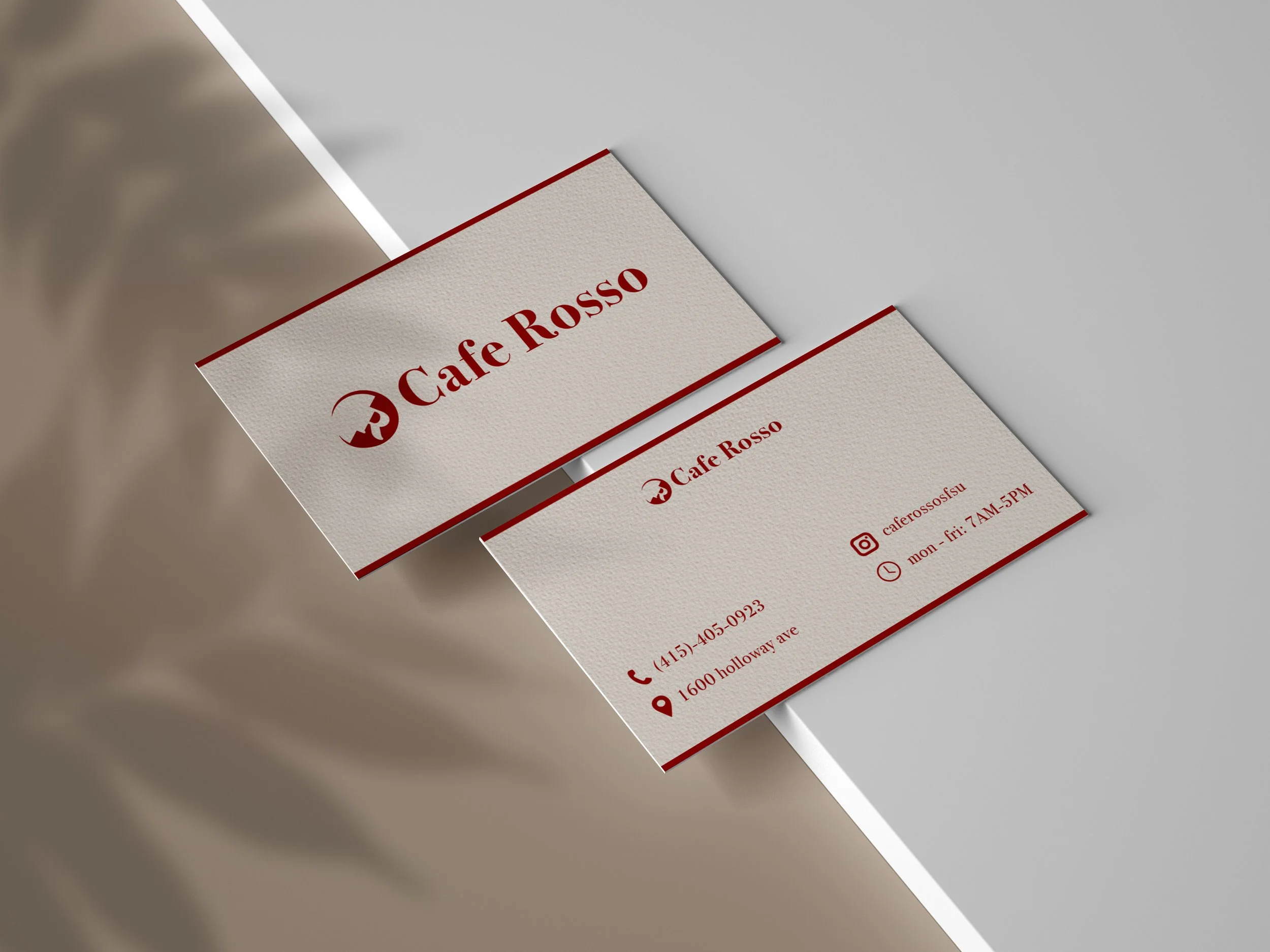
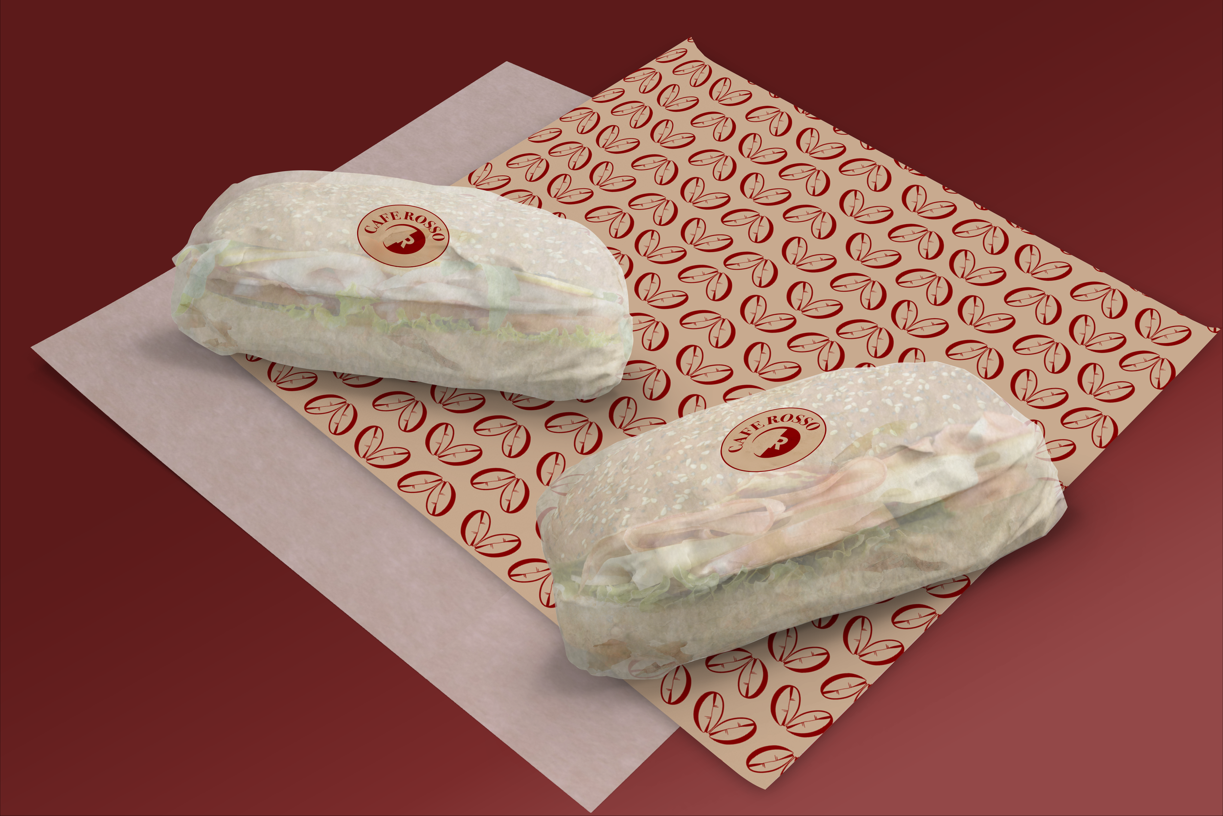
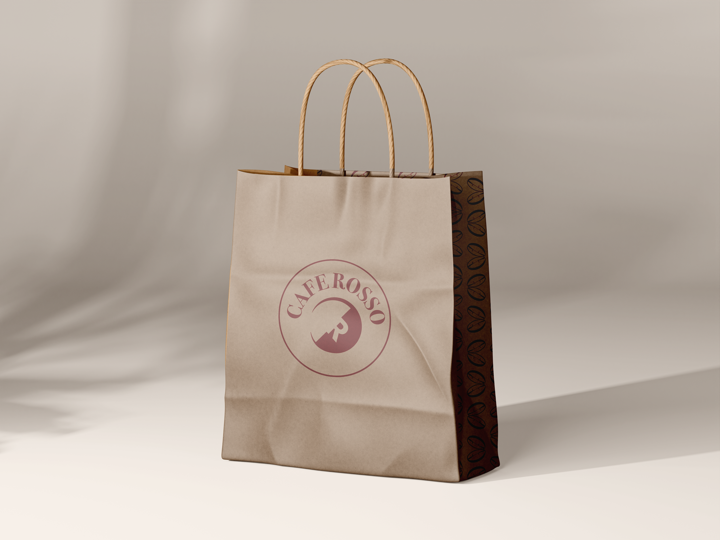
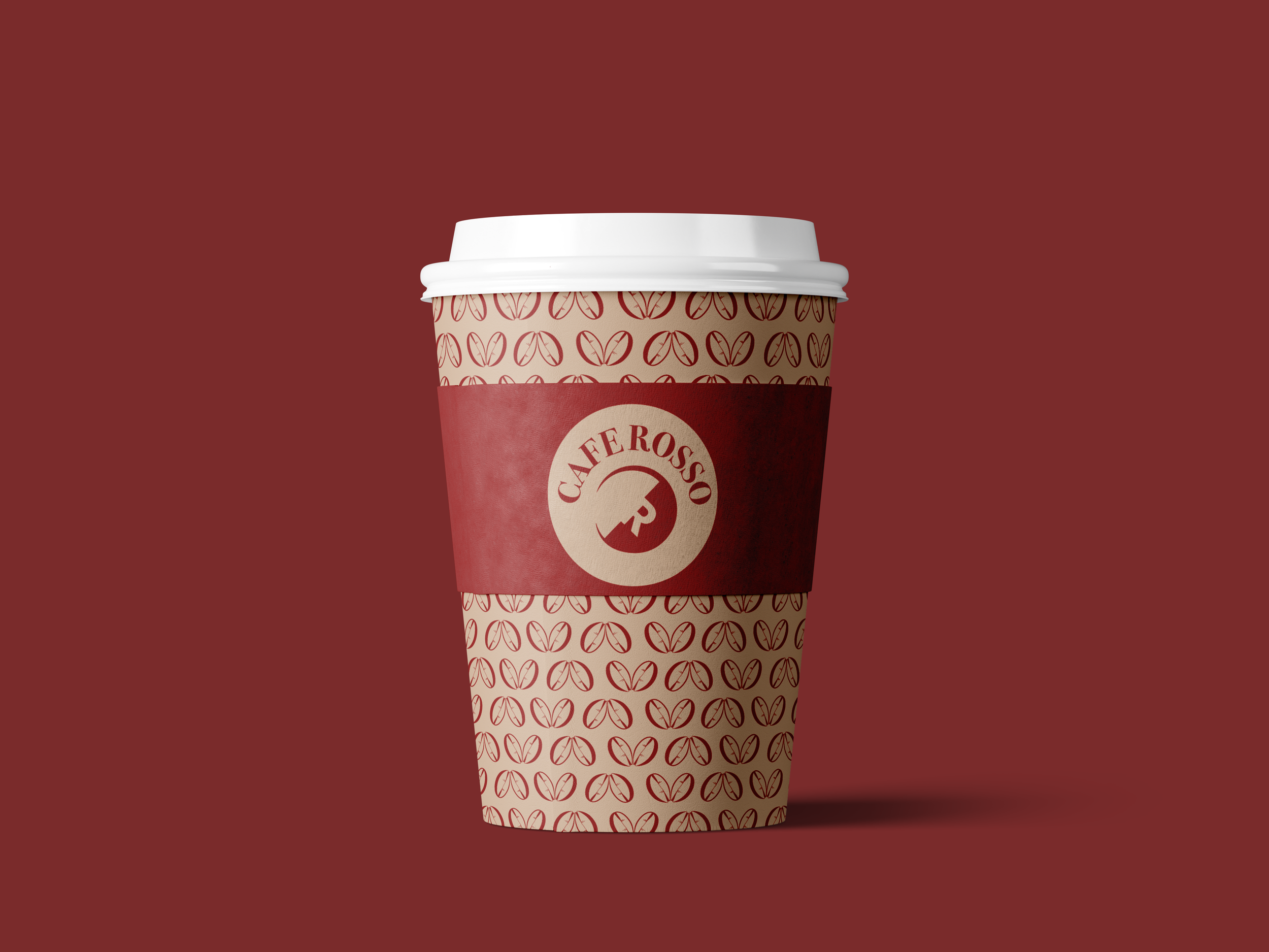
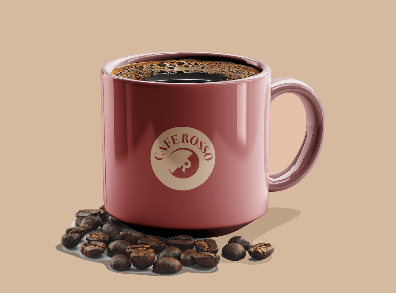
To solve this, I designed a single, cohesive identity that could be applied consistently across signage, menus, and packaging , giving Cafe Rosso one clear visual voice.


Initial Sketches
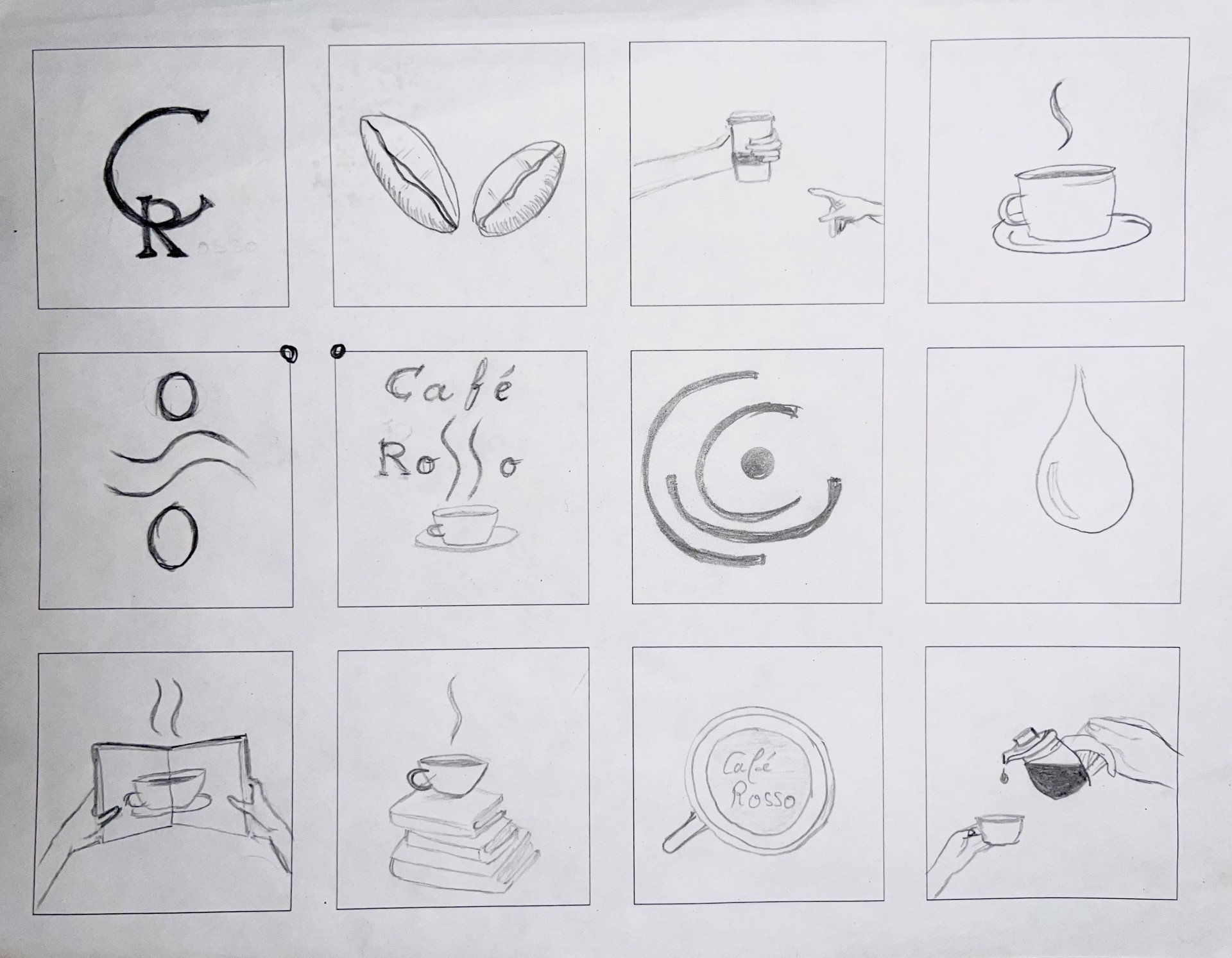
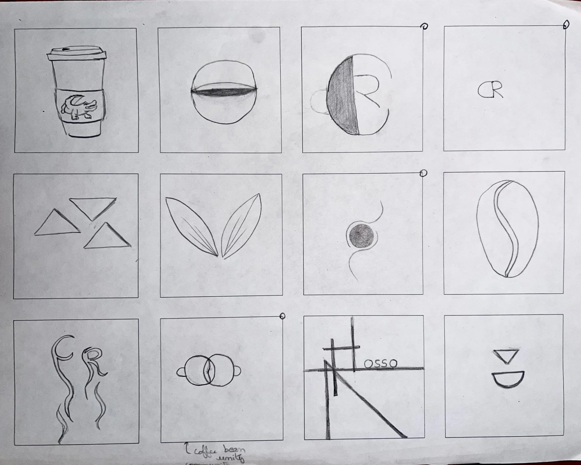
Initial Logos
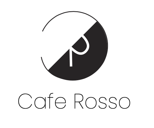


Logo Proposal
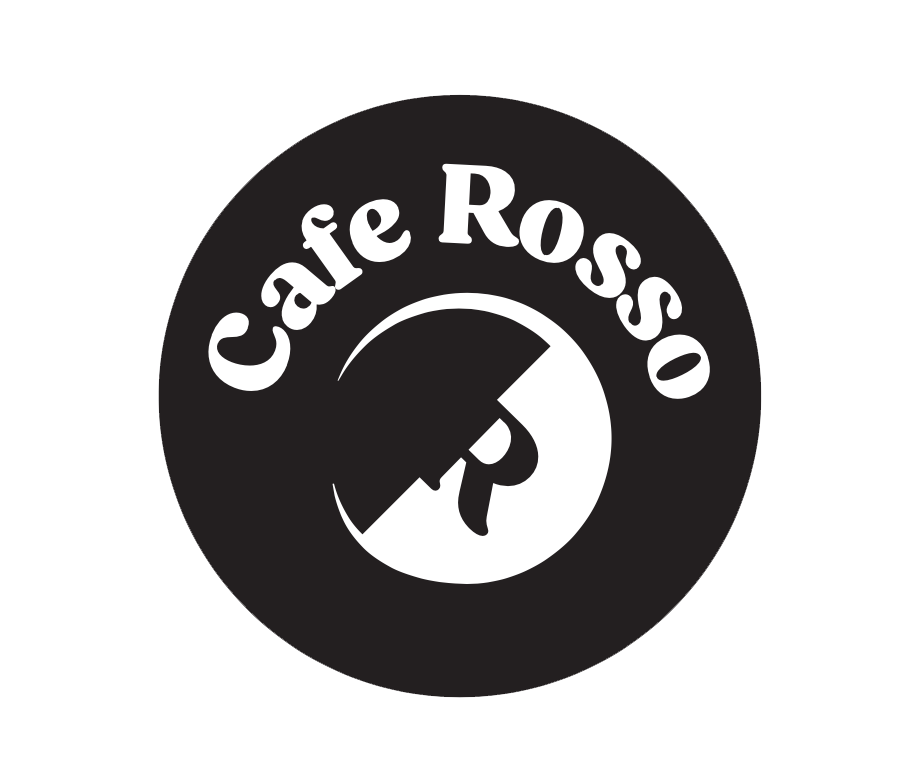
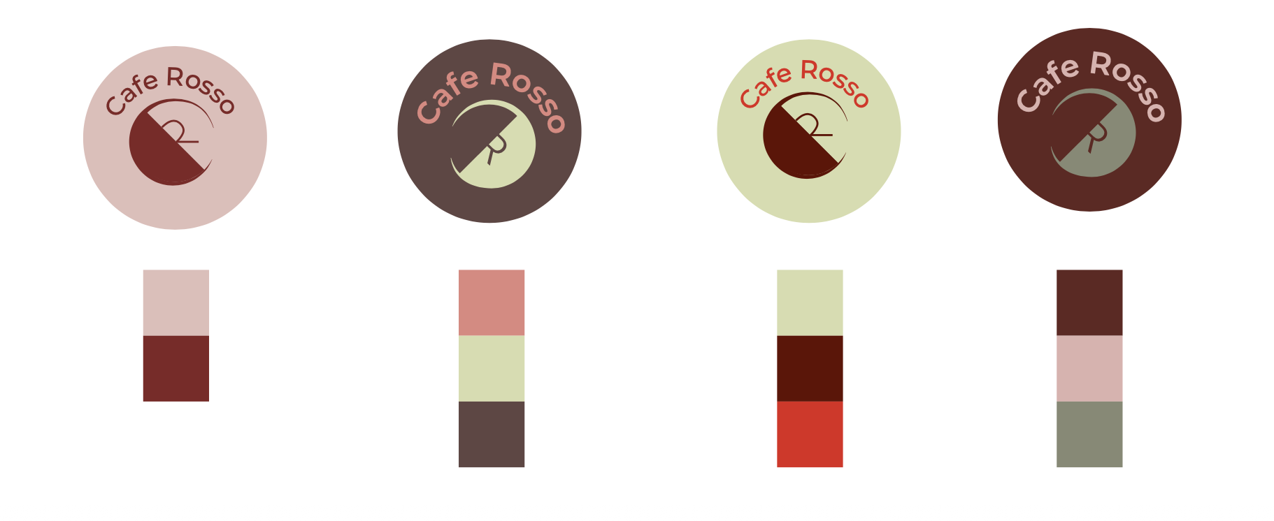
Color Exploration
Final Logo
Logo
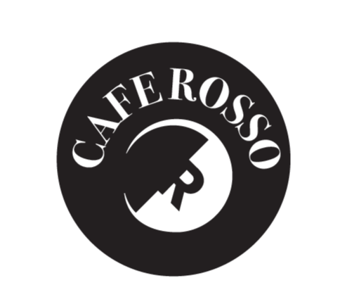
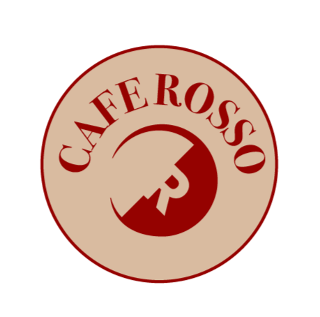
The logo is a circular emblem based on the letter C, styled as a coffee cup viewed from above, with an angled line suggesting poured coffee. The letter R inside represents Rosso.
Typeface
The brand's typeface is Bodoni, a Serif font with contrast between thick and thin strokes. Chosen for readability and a classic, timeless feel.
Brand Application